Creating brilliant infographics: visualization and design
This is part 2 of How to Create Brilliant Infographics. To read about sourcing data and telling a story, read this post.
Fourth rule: does your chart raise the bar or dunk the donut?
You have your data and you have a story to tell. So what charts, tables or other mechanisms do you use to convey your data and story?
According to The Guardian team, a good infographic needs pattern perception (i.e. easily make sense of what it is saying) and good table look-up (where is my country, my age, my phone).
I’m in favour of simple: I prefer bar charts to radars, areas and donuts. And sometimes it’s nice to see proportions represented in a completely different way as shown in this map of Africa and how many other countries would fit in it. It’s the simplicity of the image that conveys the message, not the long list of country sizes on the right.
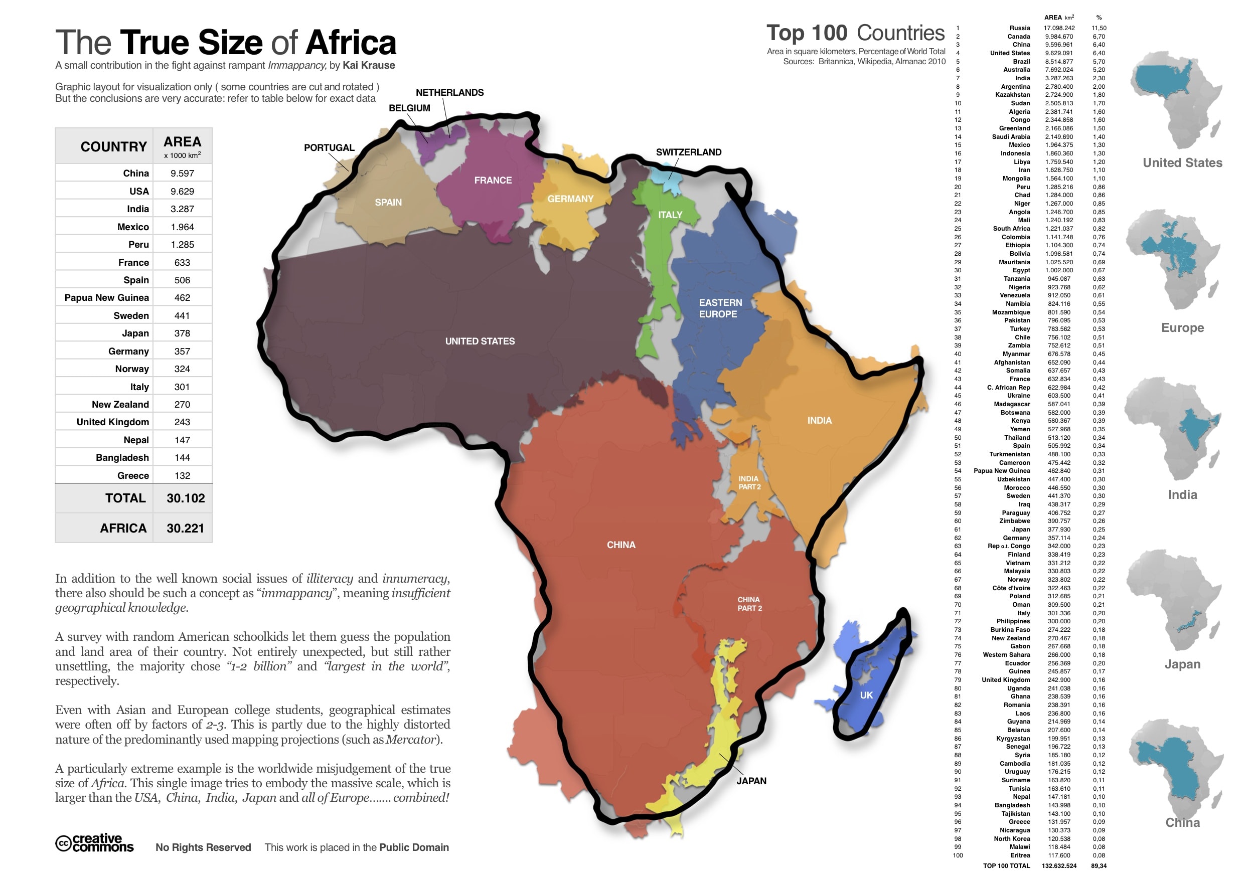
Immediately arresting: Africa is a very big place. You don’t need to read the detail
Drawing scale-sized images to represent a size or volume is a useful tool in infographic design as long as you have extremes (not so great when everything is the same size). Check out this national carbon emissions infographic as a good example, as well as this carbon emissions infographic. And this is an excellent bubbles-based infographic on SEO techniques in that it gives you a weighting but doesn’t drown you in pointless percentages you don’t care about.
Generally speaking, a bar chart is not sexy, but it can be effective. This one from the New Scientist is a good example of mixing up bar charts, donuts and simple design. Bar charts can also be bad if they tell you lots of things you really don’t want to know such as the granularity on this SEO infographic.
I’m personally not keen on donut charts such as those in this otherwise OK infographic on Twitter. If you have figured out to read this one on Twitter’s growth and or this on hotel prices around the world, then please send me a written guide. And here’s another infographic I cannot read: number of countries in successive Olympics.
Occasionally, what may seem like a complex, convoluted infographic, such as this one on the plot lines in Booker Prize long-listed novels, is actually quite arresting if you can stick with it. If you want to write a successful book (in a critical sense) write about Death.
And please don’t make them too long. This simple, attractive infographic by Homeaway about the impending ski-season is longer than a toilet roll.
Fifth rule: beauty is in the eye
Wonderful design is the persuasion, it convinces people that you are telling the truth and your infographic is worth sharing. Appearance is important so don’t cut corners with cheap design or publish a native Powerpoint chart. For instance, a documentary makes claims that Baskerville is the most trustworthy font, and we know there is cultural baggage associated with different colours, as you can see from this emotional colour-wheel designed by David Mccandless. In the UK political map, red is left wing Labour. In the US, red is right wing Republican.
What looks good and bad is very much a personal taste. Take a look at these sites for inspiration: Information is Beautiful awards, Flowing Data, Visual.ly, Visualizing.org and Cool Infographics
If you are interested in the Guardian Masterclass on data visualization, the introductory presentation is here.
If you would prefer to have some world-class infographics created on your behalf, then speak to us. We have a track-record in creating on-brand infographics for the tech industry. We understand the messaging and we’re really good at being creative within brand guidelines as demonstrated in these appealing infographics we made for Orange Business. We will source the data, construct the story, design the charts and build the infographic for you.
Author:


![Create the ideal white paper in eight weeks [infographic]](https://www.futuritymedia.com/wp-content/uploads/2020/02/Futurity-Whitepaper-Timeline-Graphic-v6-header.jpg)

![New to ABM? Follow these 5 steps to drive complex sales [UPDATED]](https://www.futuritymedia.com/wp-content/uploads/2023/04/shutterstock_1225782988.jpg)

