Visual story telling through the ages
To some, infographics may seem just to be ephemeral content, designed to be easily shared on social media. But of course, infographics are just a form of data visualisation that has been with us for half a millennium. An exhibition at the British Library, which opened last week, has some great examples of using data visualisation to explain complex science simply and directly.
The Times Higher Education has some more examples from the show including a maps of air currents across the UK, which looks pretty similar to a modern wind chart. But was actually made by Robert Fitzroy, who was the captain of the HMS Beagle upon which Darwin made his famous Voyage.
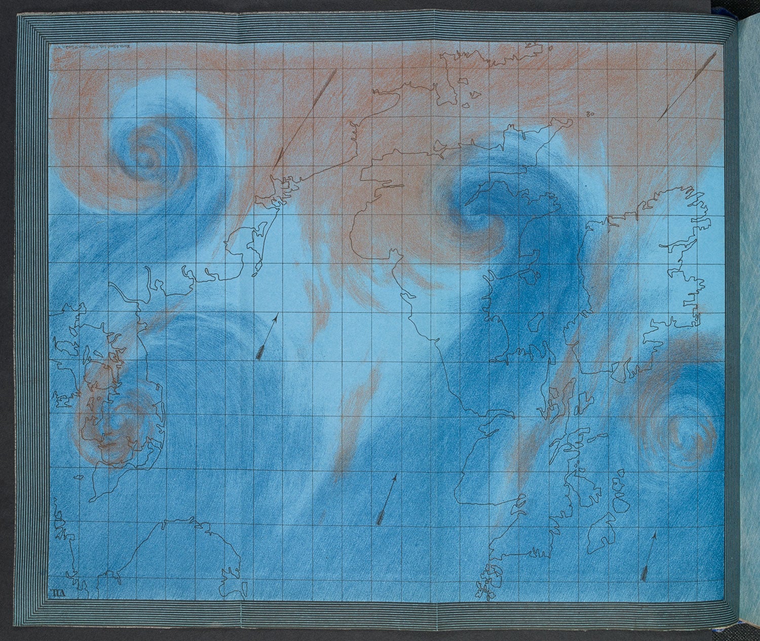
Air Currents over the British Isles. SOURCE: BRITISH LIBRARY BOARD
And I particularly like this one which shows at a glance the evolution of birds and how the 10,000 different species came into being.
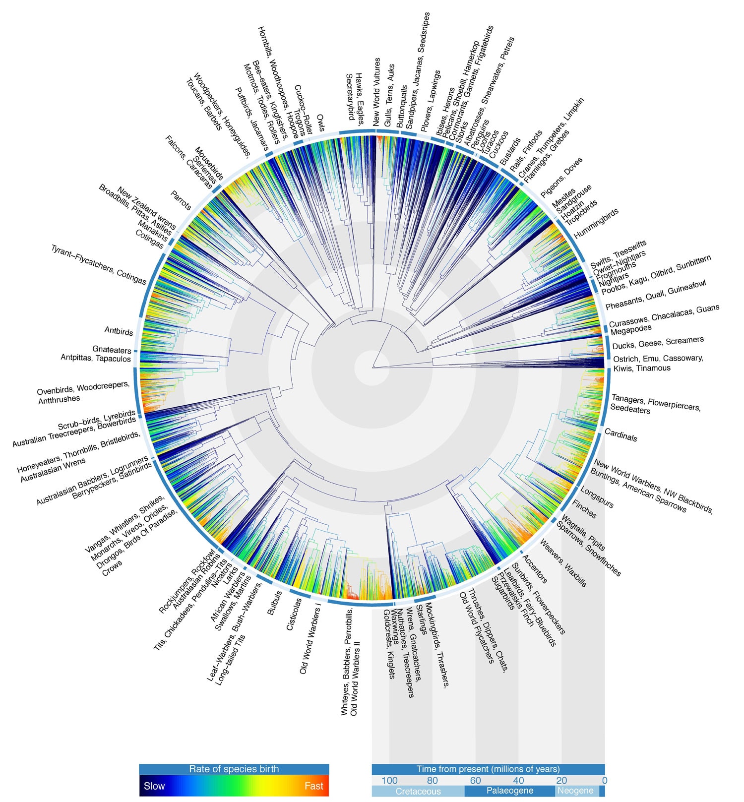
Avian Tree of Life. SOURCE: GAVIN THOMAS, WALTER JETZ, JEFF JOY, ARNE MOOERS, KLASS HARTMANN, 2012. FIRST PUBLISHED IN NATURE.
![Create the ideal white paper in eight weeks [infographic]](https://www.futuritymedia.com/wp-content/uploads/2020/02/Futurity-Whitepaper-Timeline-Graphic-v6-header.jpg)

![New to ABM? Follow these 5 steps to drive complex sales [UPDATED]](https://www.futuritymedia.com/wp-content/uploads/2023/04/shutterstock_1225782988.jpg)