A picture paints a thousand stories: how to build a brilliant infographic
Despite it being the first Mother’s Day with our 1 year old, on Sunday I was in a packed Royal Society of Medicine lecture hall for a Guardian Masterclass on data visualization. Below are some key takeaways from the genuinely interesting event which I have meshed with my own thoughts about best practice in creating infographics.
Futurity has produced around 20 on-brand infographics in the past year for major clients like Orange and Alcatel-Lucent, so I know about the challenges of finding data to support your argument, being creative within a corporate brief, and how to engage an audience that may be suffering an overload of cheap, link-baiting infographics. Nonetheless, I came back from the Guardian event with a renewed interested in visualizing data and story telling.
First rule of infographics: don’t play out of turn
There is a deliberate process to creating compelling infographics and it is hard to skip a step and expect the end-result to be attractive, informative and shareable. Always start with the data, then look for patterns in it to create your story, then think how you want to visualize and only then get down to the look and feel. That’s Data>Story>Chart>Design. I’ve worked projects where we’ve started with messaging and then looked for the data to support it. It usually undermines the infographic, resulting in statistics that don’t sit together and are not truly representative of the story you had wanted to tell. Avoid this by starting with the data.
Second rule of infographics: make sure the numbers add up
Data sourcing can be the longest part of the process if your goal is to build a data-led infographic. Make sure you search far and wide for relevant data and before looking for the story between the lines. Ensure there is meaning in the data and that your sample size stacks up. This detailed infographic about the contents of infographics is based on a dataset of just 49 infographics posted on one site. You wouldn’t call that scientific.

An infographic about infographics – but only it uses data from 49 infographics
You could use data from your own customer survey or probes into your telecoms networks, or you could find it from publicly available information such as data.gov.uk in the UK and Pro Publica in the US. Other great sources for data on demographics, wealth, health, death, broadband and so on are the OECD, the ITU, World Bank and the United Nations. There is a big push for Open Data. Not only is it good for campaigning journalists, it’s a great tool for corporates who want to understand public trends without necessarily having to use pollsters and analysts.
Obviously, the Internet is also a valuable tool for finding useful data. Rather than wading through press releases and news stories for the data to back up your story, try searching through a specific format by adding “filetype:xls” or “filetype:pdf” on “filetype:csv”. A lot of data is published online, but not necessarily in html form, so these searches will help you go direct to it. Try Googling UK prison population 2012 filetype:xls as example.
In the UK, the Freedom of Information Act (FOI) is another source of public data which may not be published but is available if you specifically request it. However, if any corporate is writing to a UK government department demanding access to unpublished data, it’s probably not the most suitable material for an infographic in social media. Same goes for data that’s leaked through sites like Wikileaks. But then, you probably figured that one out already.
Also worth a looking at is Gapminder, which has some great data but also lets you analysis seemingly disparate datasets and play with the time frame. It’s a great example of what you can do with data representation (more of that later).
And finally, another source of data is to program a scraper to collate it documents hosted on from multiple sites. It’s not as difficult as it sounds: you can try Outwit within Firefox for free.
Third rule of infographics: tell a good story
Once you find data, you need to identify the story within it. You don’t need to be maverick genius economist to do this. But make sure your headlines match the key points, and that the salient information is not buried at the bottom of a long scroller or hidden within a muted illustration. Build your content outline as you would with a feature story. I believe that a good infographic makes sense within 5-10 seconds. If you have to read all of the axes and legends before the story leaps out, you’ve made a big mistake.
But you must be careful of including data for the sake of it or completely misrepresenting it to make your point. The Guardian’s James Ball picked out an infographic created by the Independent in 2010. It led with an infographic on the UK’s debt mountain and compared it with then Labour government’s attempt to deal with budget deficit by cutting public spending. While it looks impressive, it’s wrong. It’s mixing up debt and deficit. Most countries have debt, the task is to reduce the deficit (the different between paying the debt off at an agreed rate and your income shortfall.) As James Ball said, the deficit was actually about £100 billion making the infographics’ scale off by a factor of 9. Not so good if you print 250,000 newspapers with this on the cover.
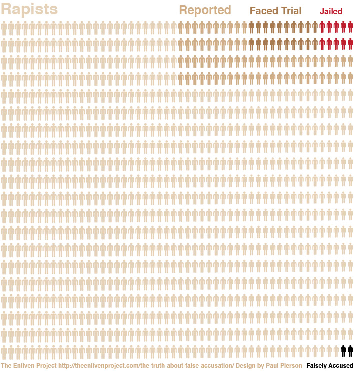
Another example is the enlivenproject.com, which attempted to show the number of rapes that go unreported compared to the number of convictions and false accusations. The problem with graphically estimating something unreported is you are putting a very specific representation of something inherently unknowable, and was this was widely criticised by blogs such as Slate. The estimates for unreported rape range from 50-95% depending on your source. It forced the enlivenproject.com to justify how they chose their data and why. This may seem unfair to pick out an infographic that is doing something positive to raise awareness of a hideous scar on our society, but it highlights the need in campaign-based infographics to be extra careful with your data and interpretation to ensure you don’t give ammunition to your opponents or naysayers.
Sometimes, you have some data and a good design but there just isn’t a story. Check out this rather tedious infographic about social media and big brands . What does it tell you? That the biggest brands use the biggest social media platforms? You could say that in a sentence.
Read the second post on this topic: how infographic design is responsible for ‘persuasion’ but don’t be undermined by poor data visualization.
![Create the ideal white paper in eight weeks [infographic]](https://www.futuritymedia.com/wp-content/uploads/2020/02/Futurity-Whitepaper-Timeline-Graphic-v6-header.jpg)

![New to ABM? Follow these 5 steps to drive complex sales [UPDATED]](https://www.futuritymedia.com/wp-content/uploads/2023/04/shutterstock_1225782988.jpg)


